It’s One Room Challenge time again! You might remember that I renovated our kitchen for the spring challenge. That project was a handful, but the end results were so impactful on our lives. I think we underestimate how much a well-designed space, a new color scheme, and better organization can make us happier living in our homes.
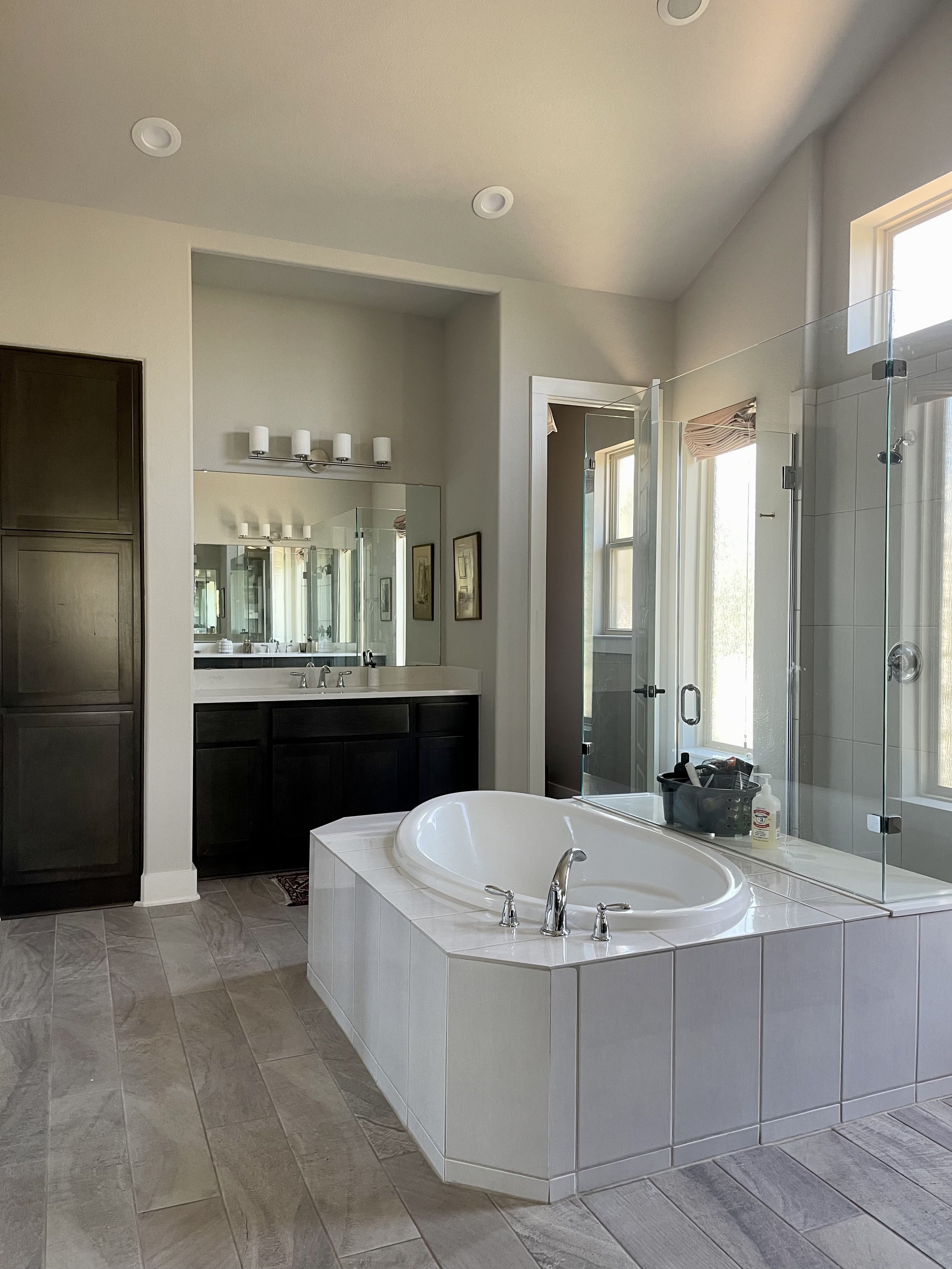
The kitchen spurred us on to create a primary bathroom that is more to our liking. After moving into this house almost two years ago, we knew right away that we wanted to change things, mainly the shower and tub area.
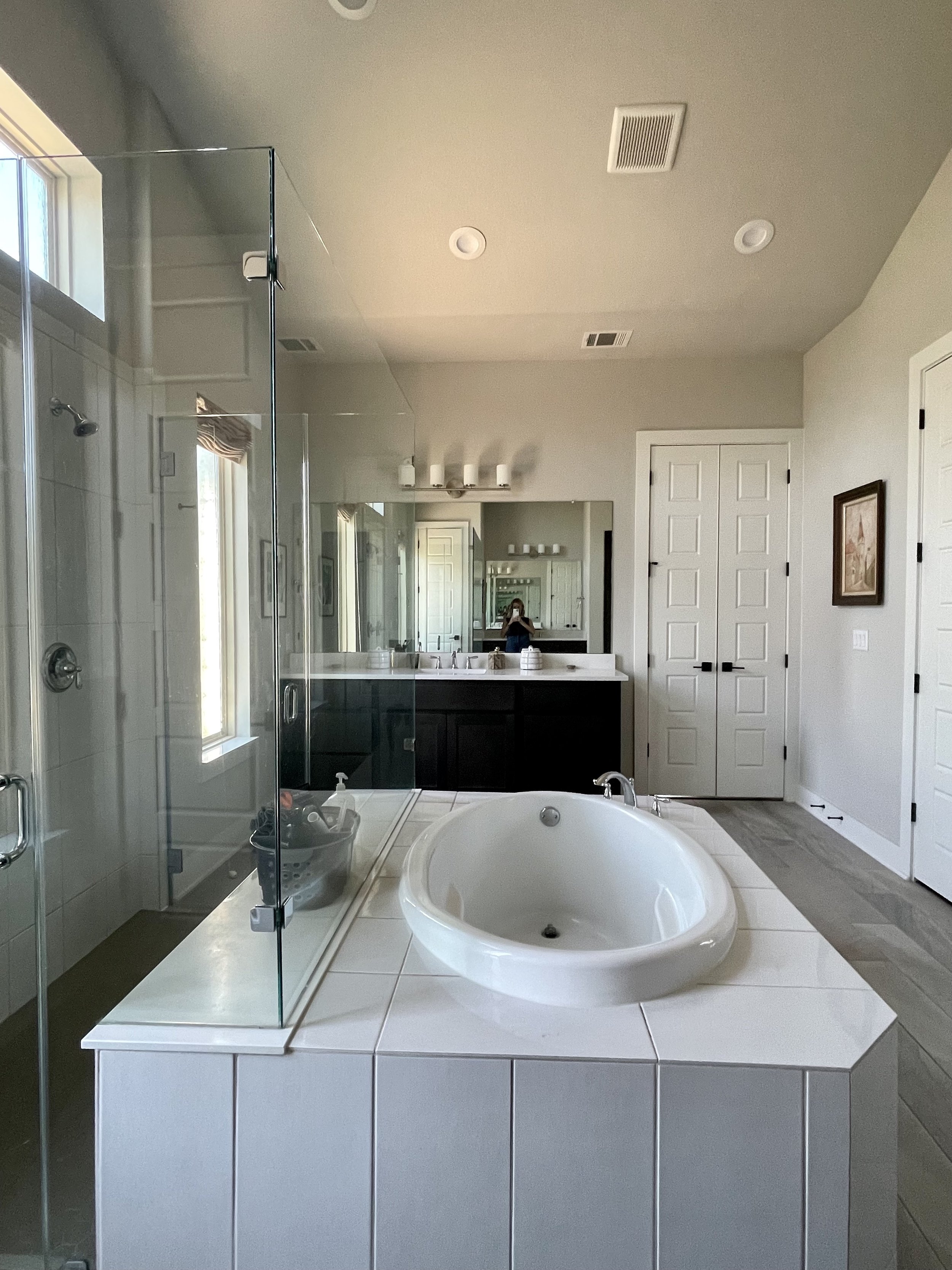
The tub takes up too much room, especially since we never use it. I’d consider removing the tub altogether if this was my forever home. Since we do have to consider resale, we’ll be putting in a smaller freestanding tub.
The shower is all glass on three sides. We call it the “display case” because it makes us feel like animals in a zoo when we’re using the shower. I guess I’m just not an exhibitionist! This is very much a personal preference, many people like the openness and the flow of light with a glass shower surround. After two years of using it as is, we still think we’d much prefer to close the shower in with a solid wall. Storage for shower products is also an issue. The only place to put them is right on the bench, on display. No matter what we do, it looks messy. A solid, tiled shower wall will solve that problem. We’ll add a large niche or two to house the products.
Next week I’ll be sharing mood boards and all the fun cosmetic upgrades I have in mind.


