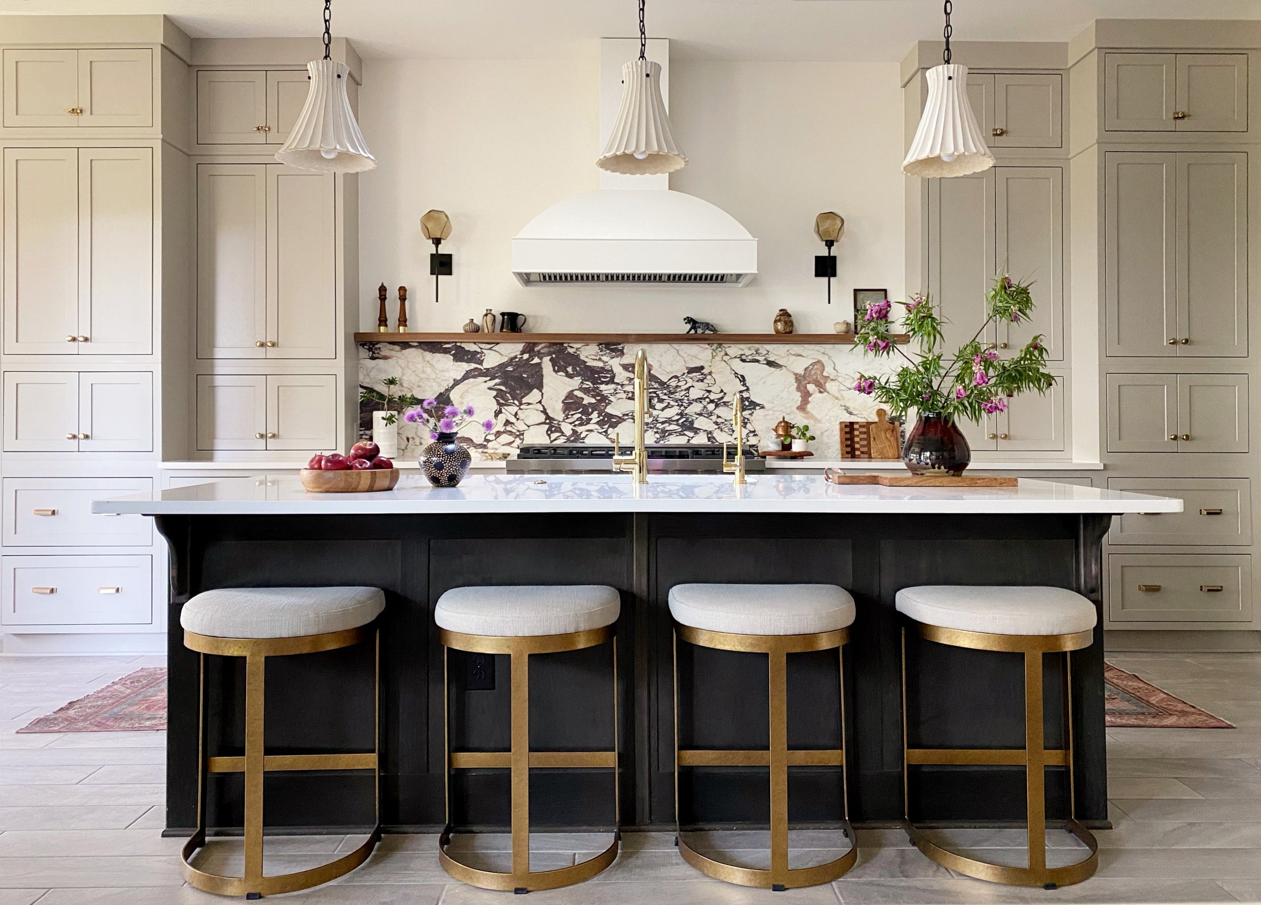
We did it! Both rooms are finished and I am absolutely thrilled with the results. Months of careful planning paid off. We had very few hiccups once all of our materials finally made it to us.
The Kitchen
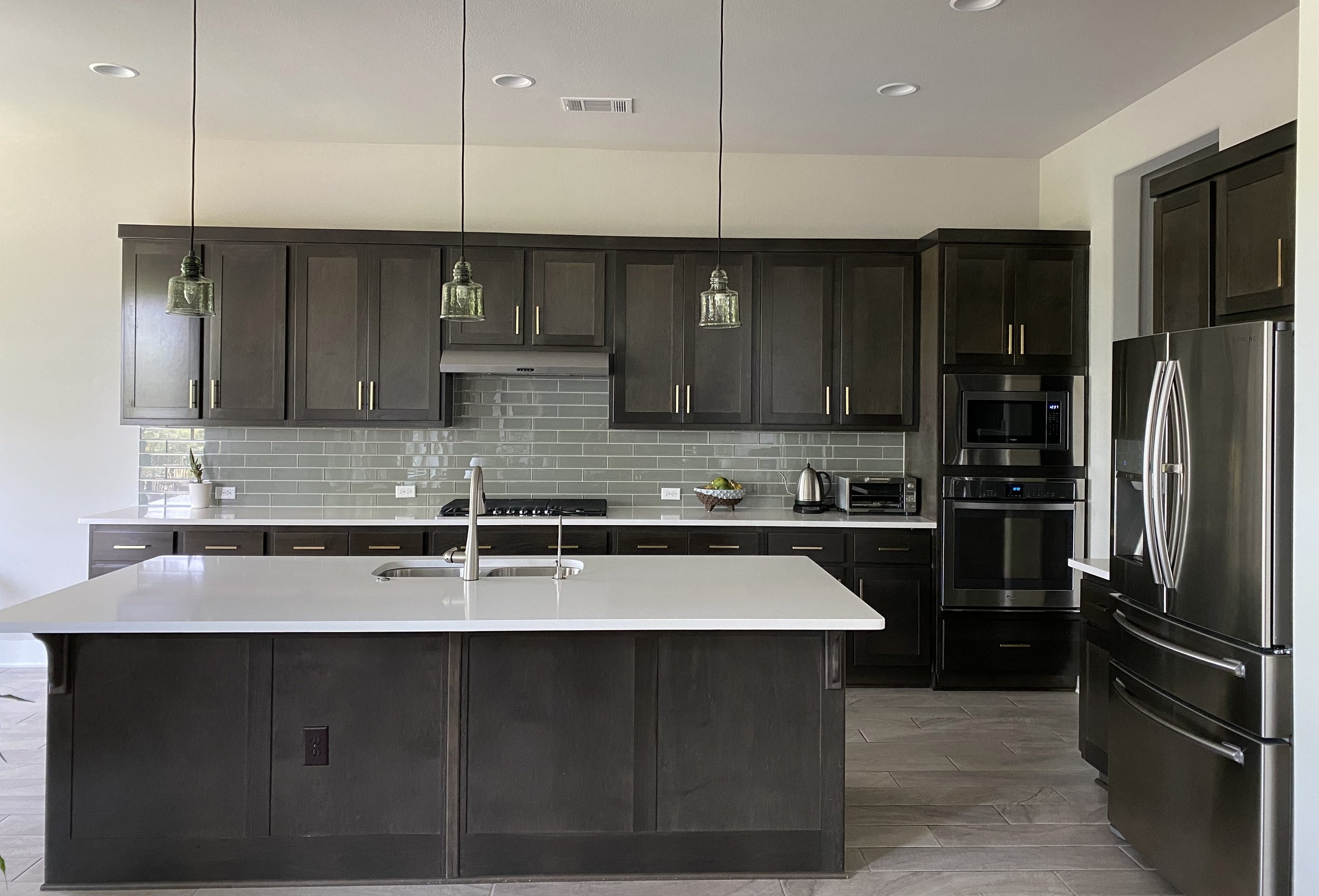
Lets’s take a look back at what we started with.
The goals of this project were to:
create a focal point
add symmetry
upgrade large appliances
hide small appliances
improve storage
lighten and brighten the space
add some curves to this very rectilinear house
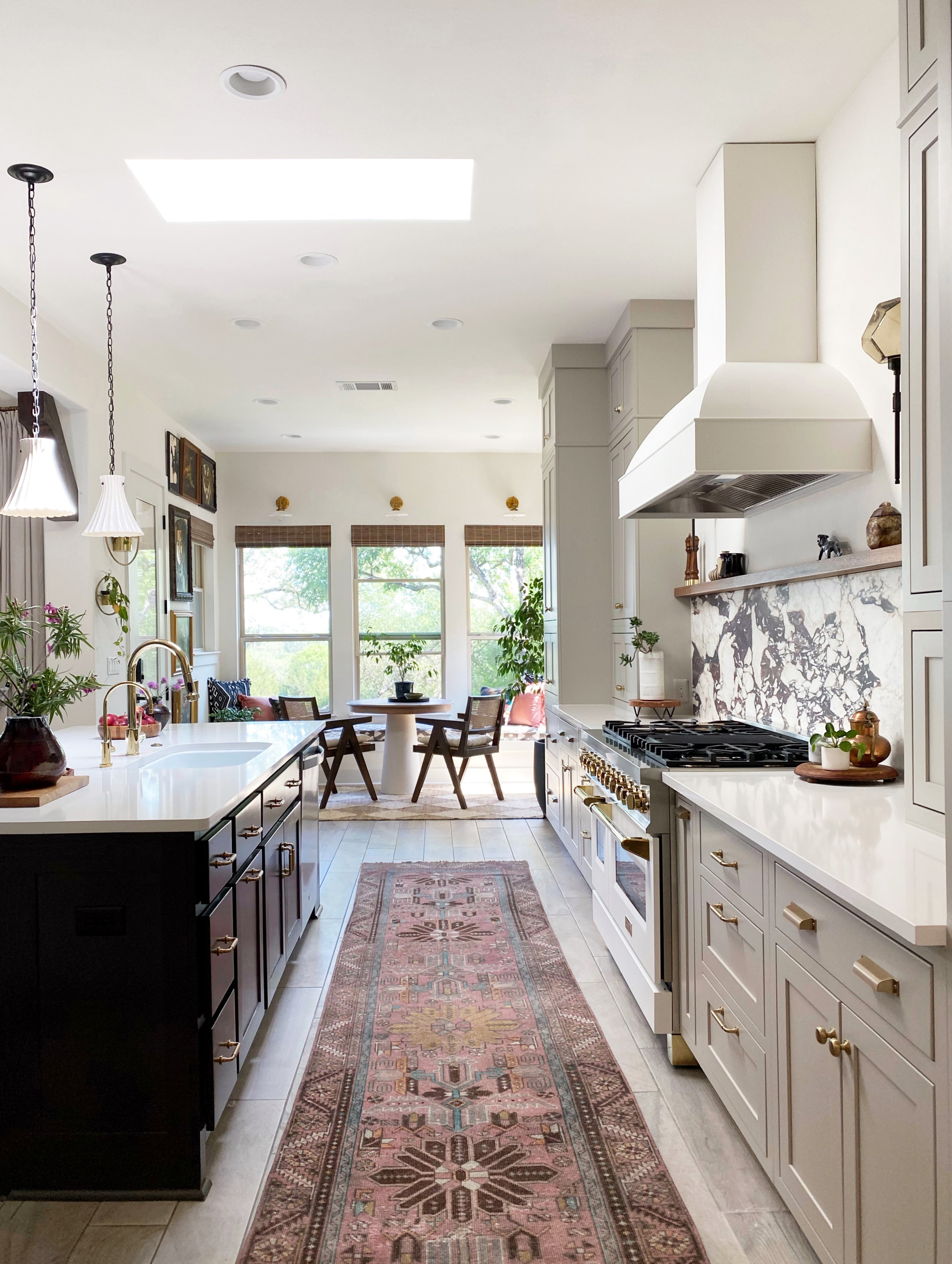
I believe we achieved those goals, plus the open plan of our home is much more cohesive. AND, this kitchen just makes me so happy now!
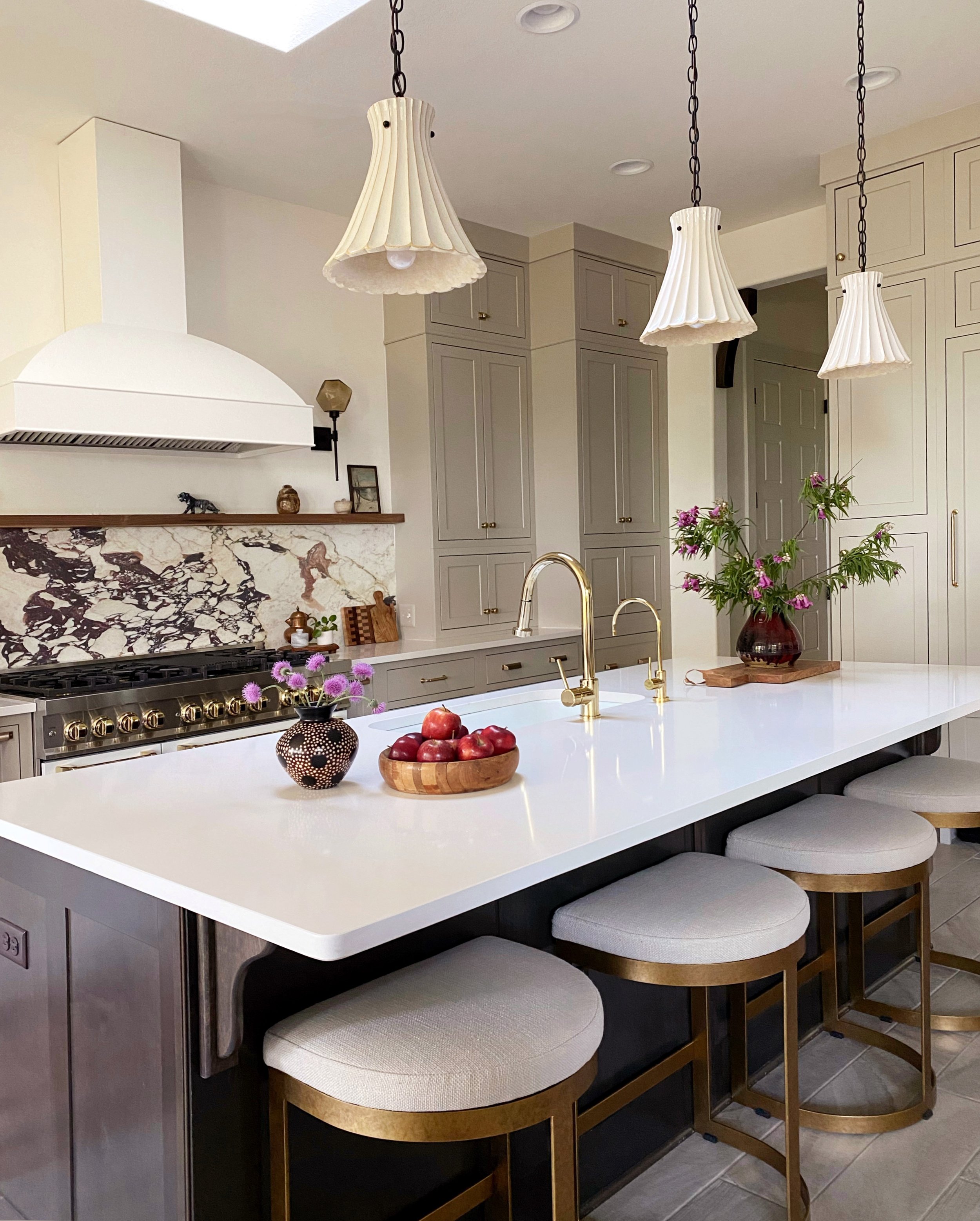
We made a lot of changes, but first, let’s talk about what we didn’t change. The tile floor stayed. It was the one thing that kept me up at night— I would have loved to change the flooring but at this point, it just wasn’t possible. We also kept the island fully intact and only changed the sink, faucets, and garbage disposal push button.
What we did change:
All perimeter cabinetry-I chose an inset style and went all the way to the ceiling. The cabinet paint color is Sherwin Williams Anew Gray. While I’m absolutely thrilled with the end result, I’ve chosen not to discuss the company that the cabinets came from at this time. We had a lot of damage upon arrival and some issues still need to be rectified.
Island lights These were an impulse buy and they’re perfect. The house in general needs some curves, so these bell-shaped pendants fit the bill.
Built-in paneled refrigerator. This was the budget buster! We decided to go for it and do a fully integrated refrigerator with custom panels. The hidden refrigerator makes such a huge difference in the feel of the kitchen. My husband joked that we can never ever have a freestanding refrigerator again.
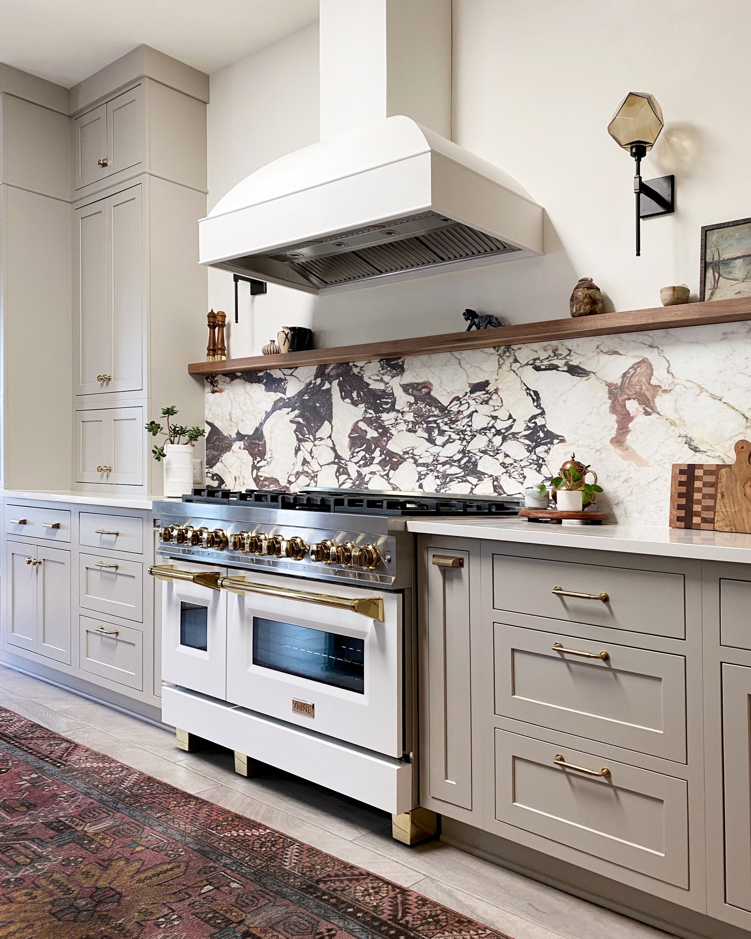
Backsplash I feel so lucky to have found this piece of honed Calacatta Viola marble. It’s just so beautiful and has more color variation than the other pieces I’d looked at.
Hood I went with a classic style painted wood hood. As mentioned before, this house is all rectangles and sharp angles, so I knew I didn’t want a boxy range hood. The paint color is Benjamin Moore White Dove.
Sconces The Gem Belvedere Sconces we added to the range wall beautifully elevate the space. They were gifted by Hammerton Studio; I didn’t use any other sponsored products in this kitchen, so I’m so thankful for this partnership. I chose the matte black finish with bronze glass. I love a handmade element in every room I design, and these sconces are just perfect. Each glass shade is handmade in the USA. They have integrated LEDs in the base so that there is no visible lightbulb seen through the glass. It’s such a great feature!
Range We went from a 36-inch cooktop to a 48-inch dual fuel range. The larger cooking surface has been wonderful, and this range is so much more stylish than a wall oven.
Walnut ledge. My husband sourced this beautiful piece of walnut and created the ledge over the range using a Hovr bracket. We left the wood its natural color and sealed it with matte Polycrylic.
Skylight. The ability to add a skylight over the sink was our saving grace. You can have the most beautiful materials, but it all gets lost without natural light to see them.
What’s Left
While I’m calling this project done, a few touch-ups are needed. We also have additional work to do on the hood ventilation system ( you can see it’s not fully installed where it meets the ceiling). I will continue to work with the cabinet company to get some replacement pieces.
All sources are at the end of the post.
Utility Room
This part of the renovation is almost as exciting as the kitchen. If you remember, we decided to move our kitchen cabinets into the utility room. The room started out with no built-in storage.
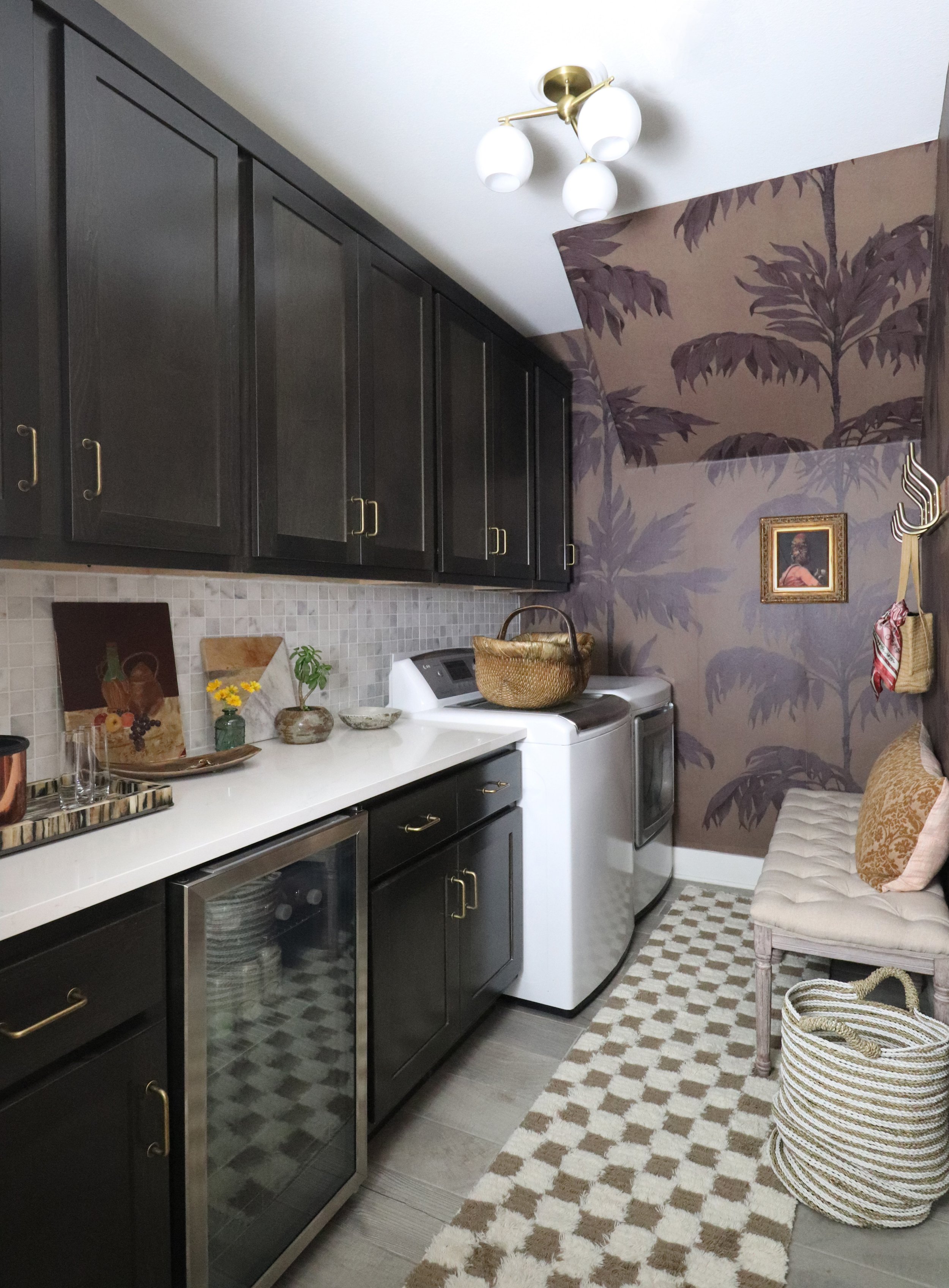
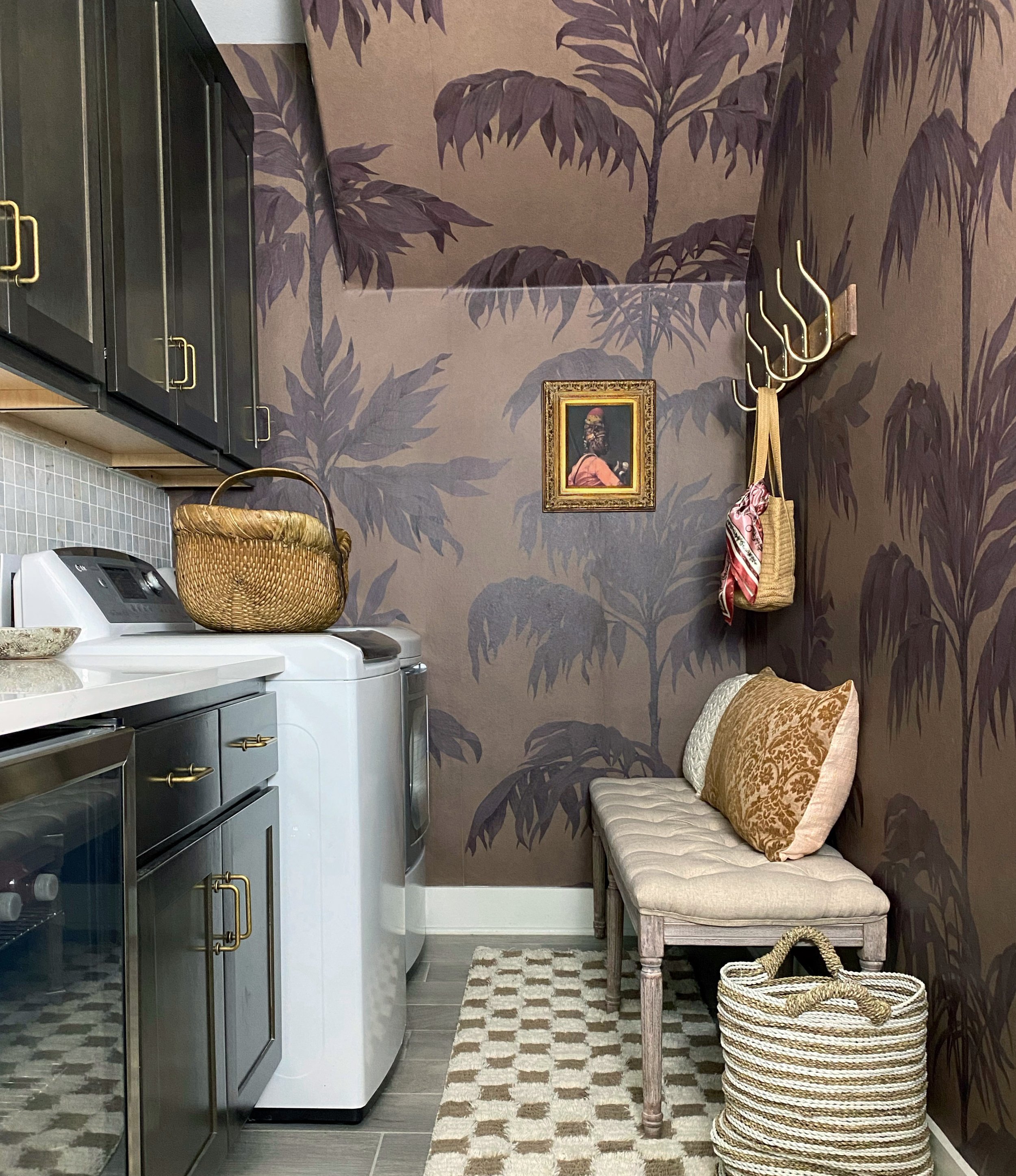
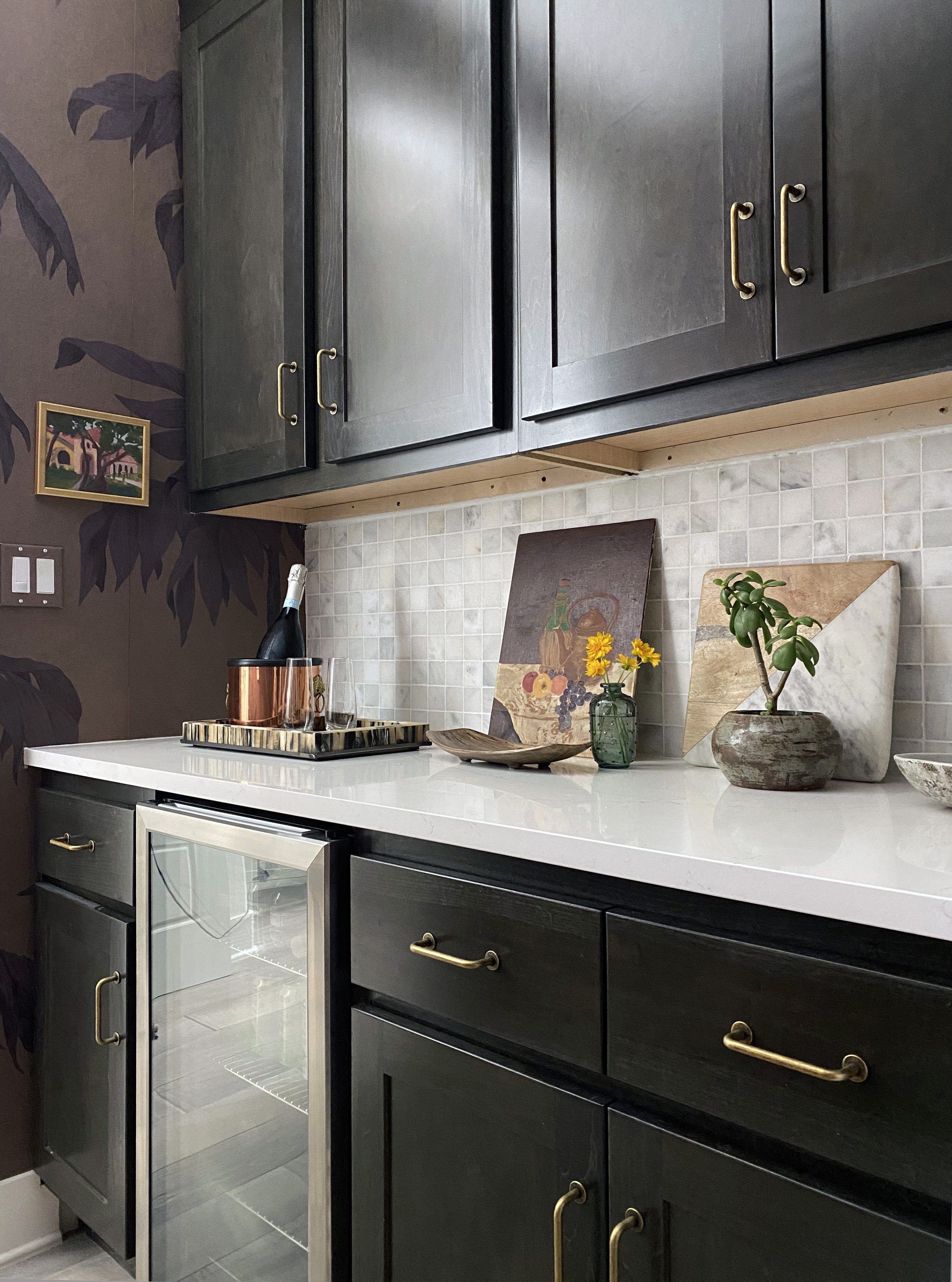
I promised I was going to have fun with this room! It’s tiny, just six feet by ten feet. It was the perfect opportunity to use some bold wallpaper. I honestly can’t believe it’s the same space.
I don’t know how these custom (odd sized) cabinets fit perfectly in this room, especially around our existing 19 inch wide beverage cooler, but they did. What a gift. The storage we have in here now is life-changing.
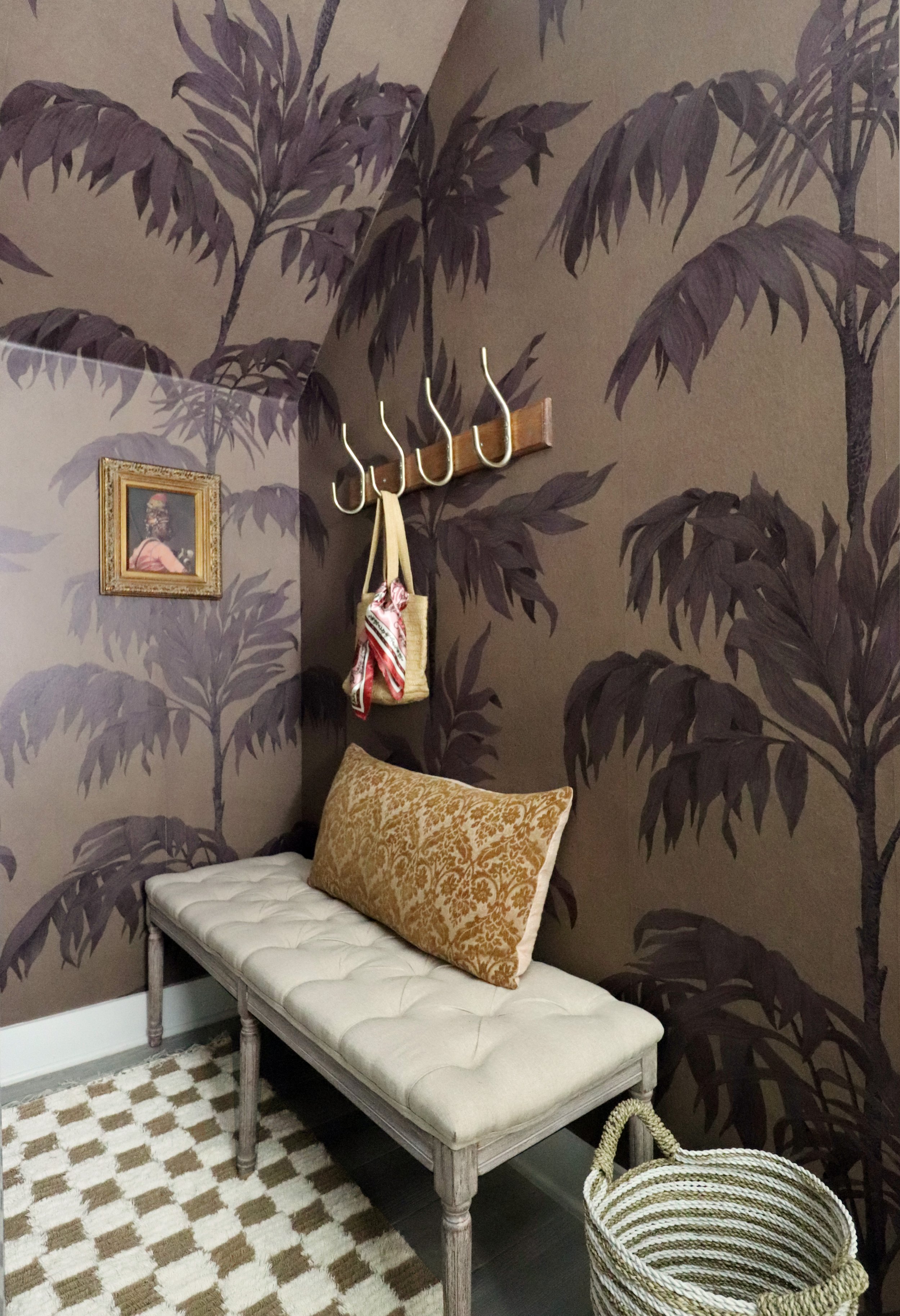
I want to thank Belarte Studio for gifting their wonderful wallpaper for this space. I chose Vintage Palm Tree in Burgundy. Their wallpaper is super high quality and custom printed for the room, so there is no waste. It’s one of the easiest installs I’ve ever done, even with that wonky angle on the back wall.
These large palm trees in a small room under our staircase give a magical feel that’s completely unexpected. It gives me an Art Deco/Alice in Wonderland vibe mixed with an ode to my Southern California in the 80’s heritage- hello palm trees and checkered patterns. I just love walking in to this space. I literally hated it eight weeks ago!
We can no longer call this a laundry room; it’s definitely a multi-hyphenate room now. Please note the celebration station with prosecco waiting for us. Lots to celebrate!
Sources
Kitchen
rug vintage one of a kind from Etsy
salt and pepper similar
marble tiger similar
Utility Room
Click here to see all of the other One Room Challenge reveals!


