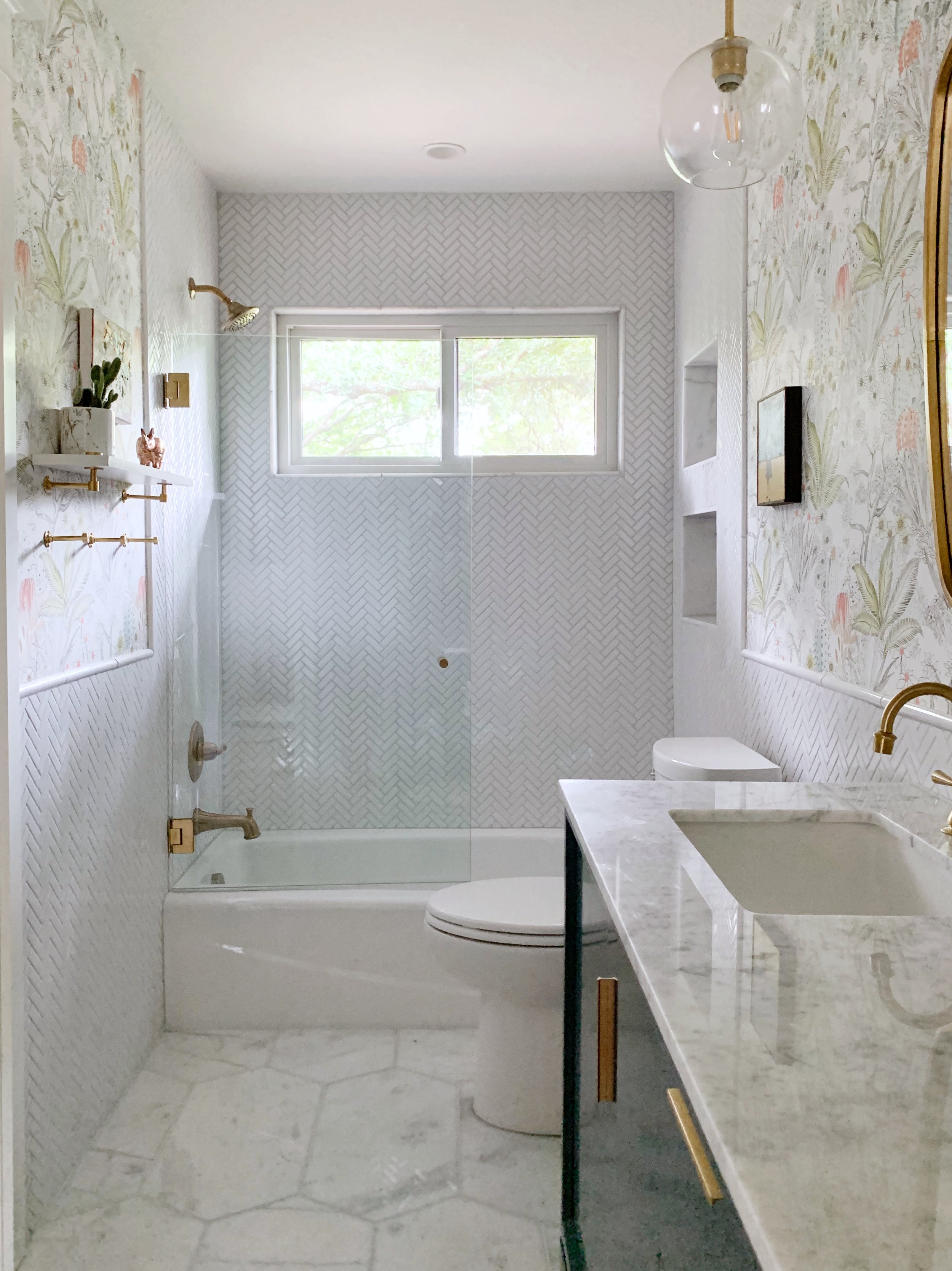
Done! I’m so excited to reveal this bathroom; it checks all the boxes and brightens my spirits every time I walk in. I don’t have a lot of surprises since I pretty much stuck to the plan I put out in week one.
The vanity was the biggest decision and this one won out because of the carrara marble top and porcelain sinks. It comes with the option to include the faucets (which I did) to keep things simple, and I love the look. The drawer hardware was included as well, so one less decision to make.
I chose marble flooring that adds a luxe feeling to the floor. It was not hard to say goodbye to the 12x12 brown porcelain! I went with inexpensive porcelain herringbone mosaic for the wall, and opted to wrap it around the whole room at wainscotting height. This gave us a backsplash for the sink, and achieved a cleaner look than drywall and wood baseboards.
I used pendant lighting rather than wall sconces for a modern look. The three globe pendants provide a bright sunny light that this room needs, but due to a miscommunication with my contractor, they were installed slightly shorter than I would have liked. I’m looking in to whether or not we can lower them a few inches more.
Proof that the little things can make a big impact. New shaker style closet doors and door trim painted glossy Benjamin Moore White Dove reflect the updated look of our kitchen pantry. The brass cobra door handles are just for fun.
I can’t forget about the new glass tub door which has freed us from ever buying a shower curtain or liner again. It opens up the space and, since it’s a kid’s bathroom, I never have to worry about the curtain being used correctly (ahem). Hoping we’ve seen the last mini bathroom flood!
Now for some of the decorative details. Thank you to Pepe and Carols for sponsoring me with their gorgeous solid brass towel rods and matching modern shelf. The two together are the perfect mix of form and function. I originally ordered five towel hooks, but my husband insisted on hanging three, because why in the world would we ever need five??? With our first wave of guests this weekend we confirmed that we do indeed need five hooks, so two more are going up pronto.
I went with a new rug for the bathroom (rather than my beloved vintage) because its a really soft viscose and feels delightful on bare feet. To be honest, I like the room better without the rug. I’ll let the main user of the bathroom decide if she wants to keep the rug or not. We may transition to a regular old bathmat.
Lastly I should mention the wallpaper. I posted my top contenders in week 3. In the end, I decided this bathroom was not the place for anything dark or even mid toned. We wanted an airy feel and not too much contrast with the tile. Plus, this wallpaper was the most budget friendly (source linked below).
Let’s wrap up with a before and after and a deep sigh of relief. Sources are linked below.
Sources
Vanity
Floor Tile
Wall tile
Mirrors
Pendant lights
Wall Shelf
Towel hooks
Shower door
Shower and tub fixtures
Wallpaper
Marbleized planter
Closet door handles
Thank you to the One Room Challenge and media partner Better Homes and Gardens for hosting this event! I loved having the motivation and distinct deadline to pull this thing together. Now go check out all of the other challenge reveals on the ORC blog.


